
Overview
Bower & Thorn is a hypothetical floral shop brand created as part of a brand identity project. The brief required developing a complete brand style guide including a brand promise, original vector logomark and wordmark, logo lockup variations, a color palette, and typography system — all designed to work cohesively as a unified visual identity.
Ideation & Logo Development
The process began with a brainstorming exercise to define the brand's personality and mood. Keywords like earthy, romantic, organic, hand-crafted, and meaningful shaped the direction of the visual identity. A moodboard was then created to establish the aesthetic — drawing from natural textures, muted color palettes, and botanical imagery.
Rapid logo sketches were completed to explore different directions for the logomark — ranging from illustrated botanicals to more geometric interpretations. Existing floral brand logos were also referenced for inspiration before landing on the final direction.
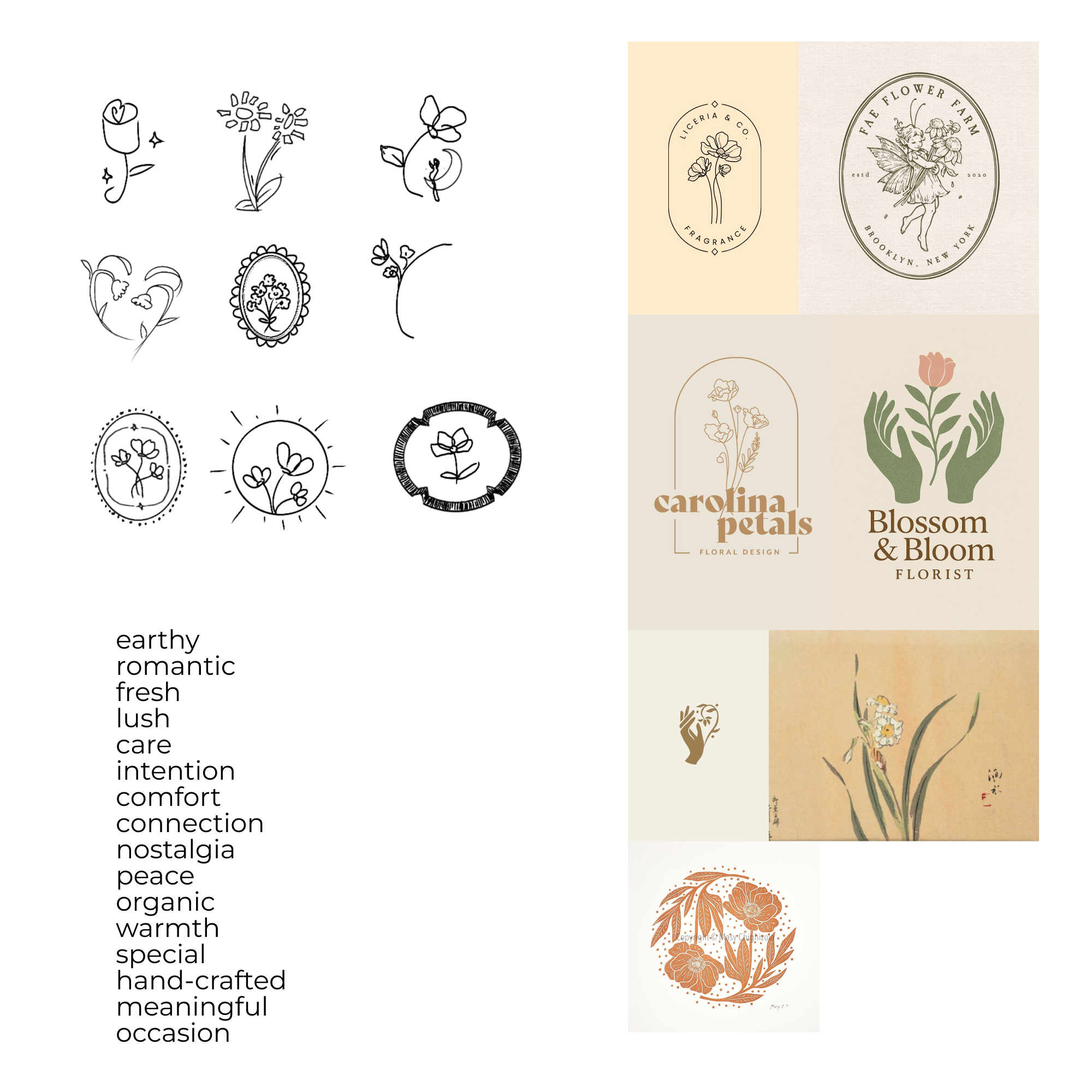
Brand Brainstorm & Logo Development
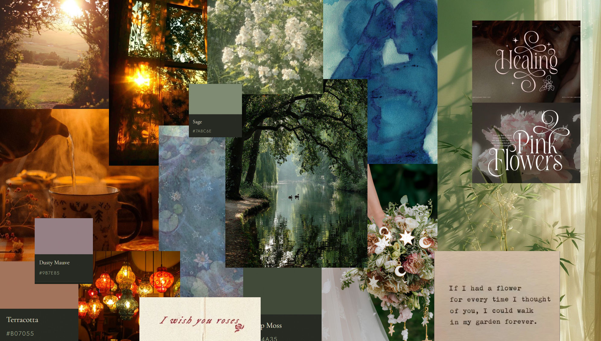
Moodboard
Final Style Guide
The final style guide spans six pages covering all required brand elements.
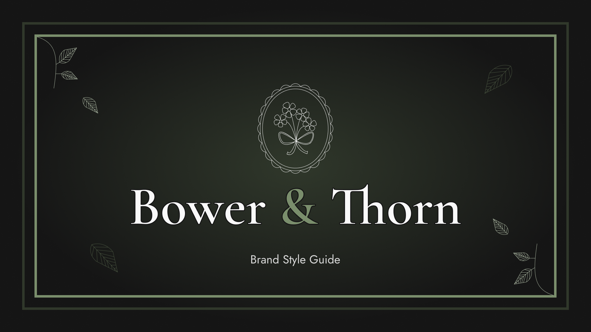
Cover Page
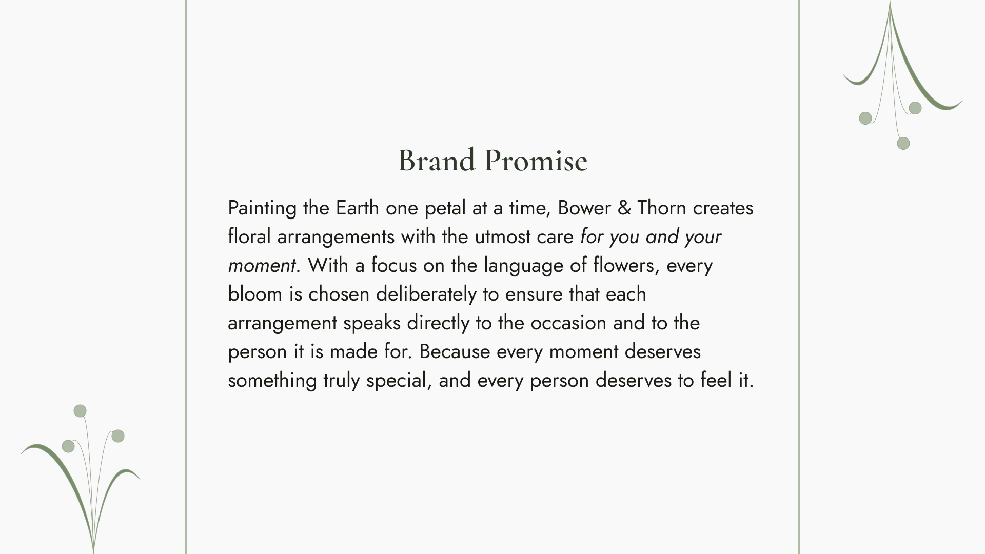
Brand Promise
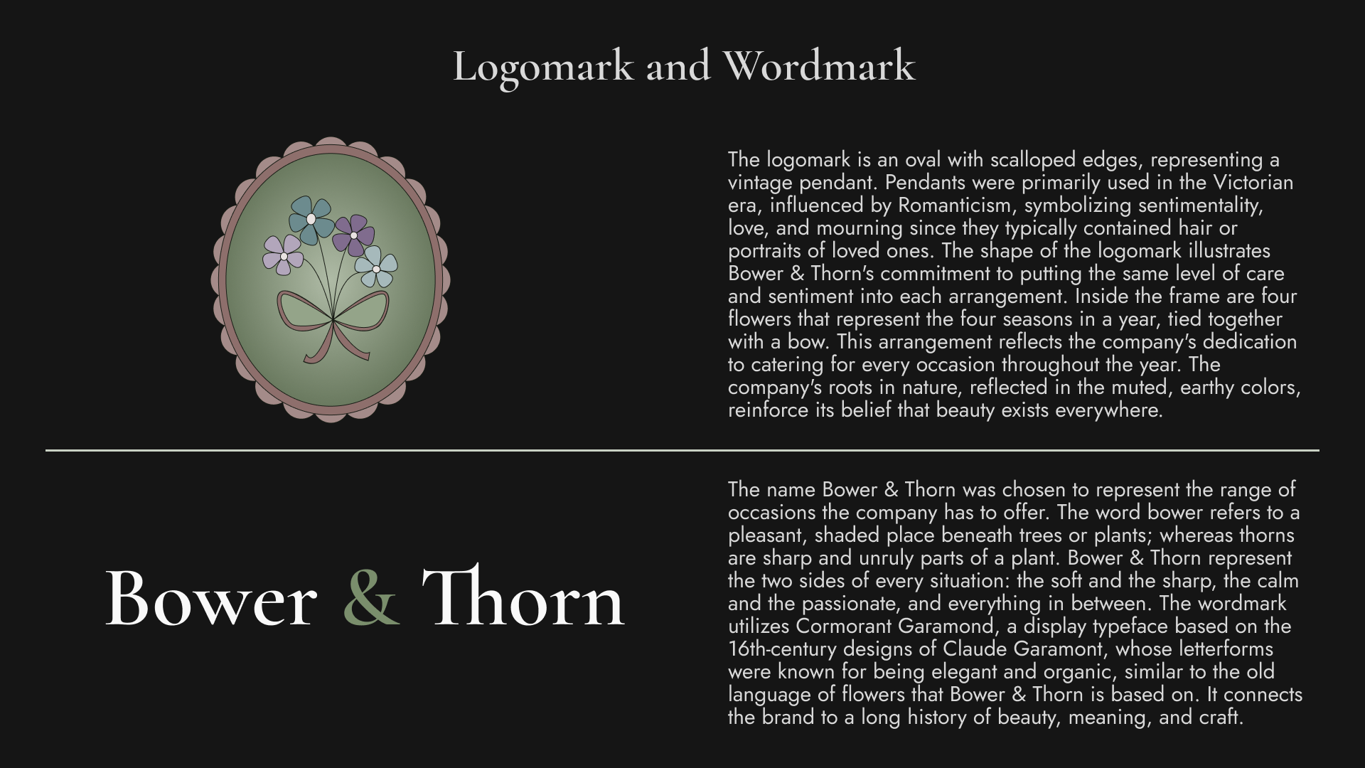
Logomark & Wordmark
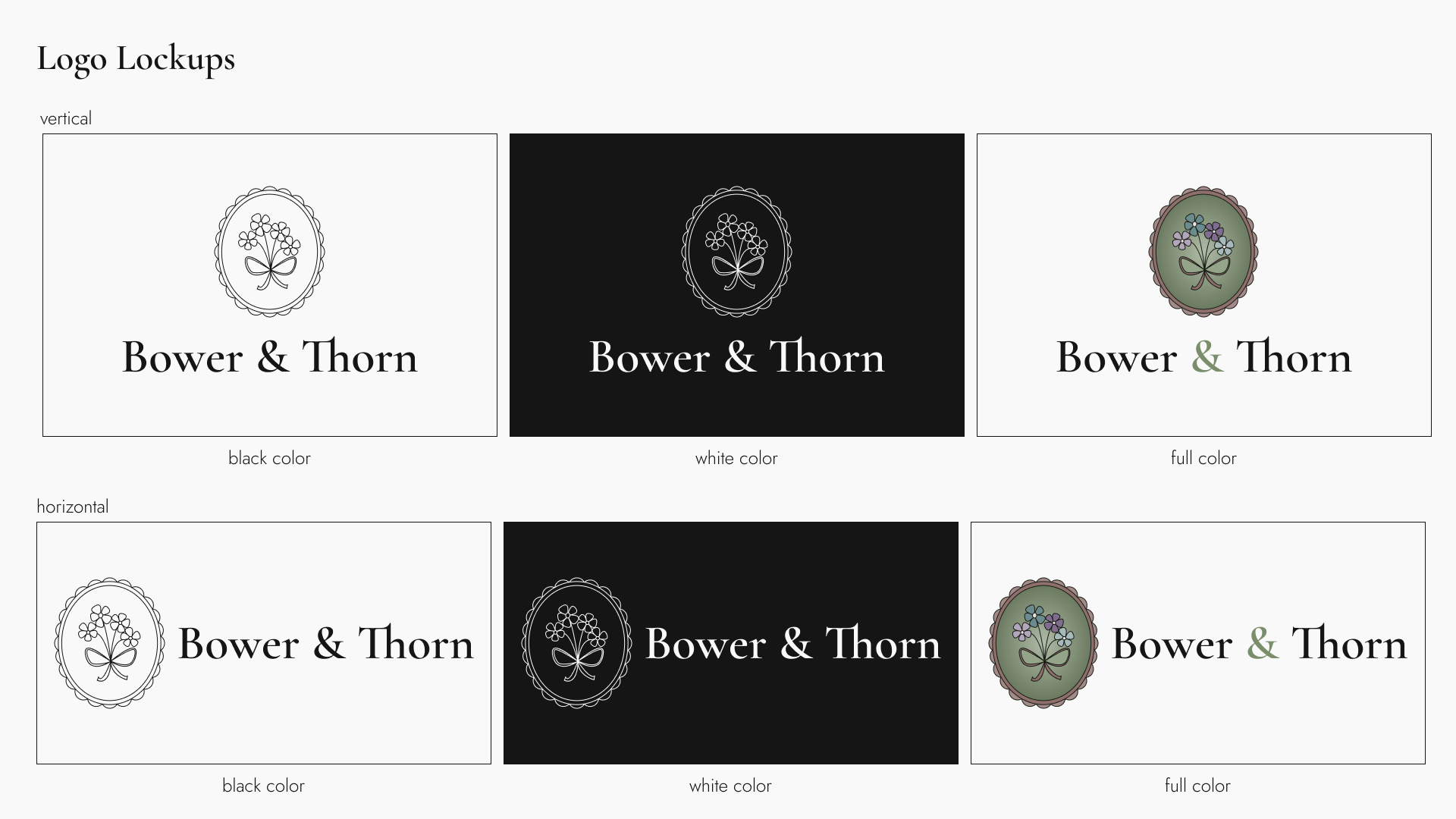
6 Logo Lockup Variations
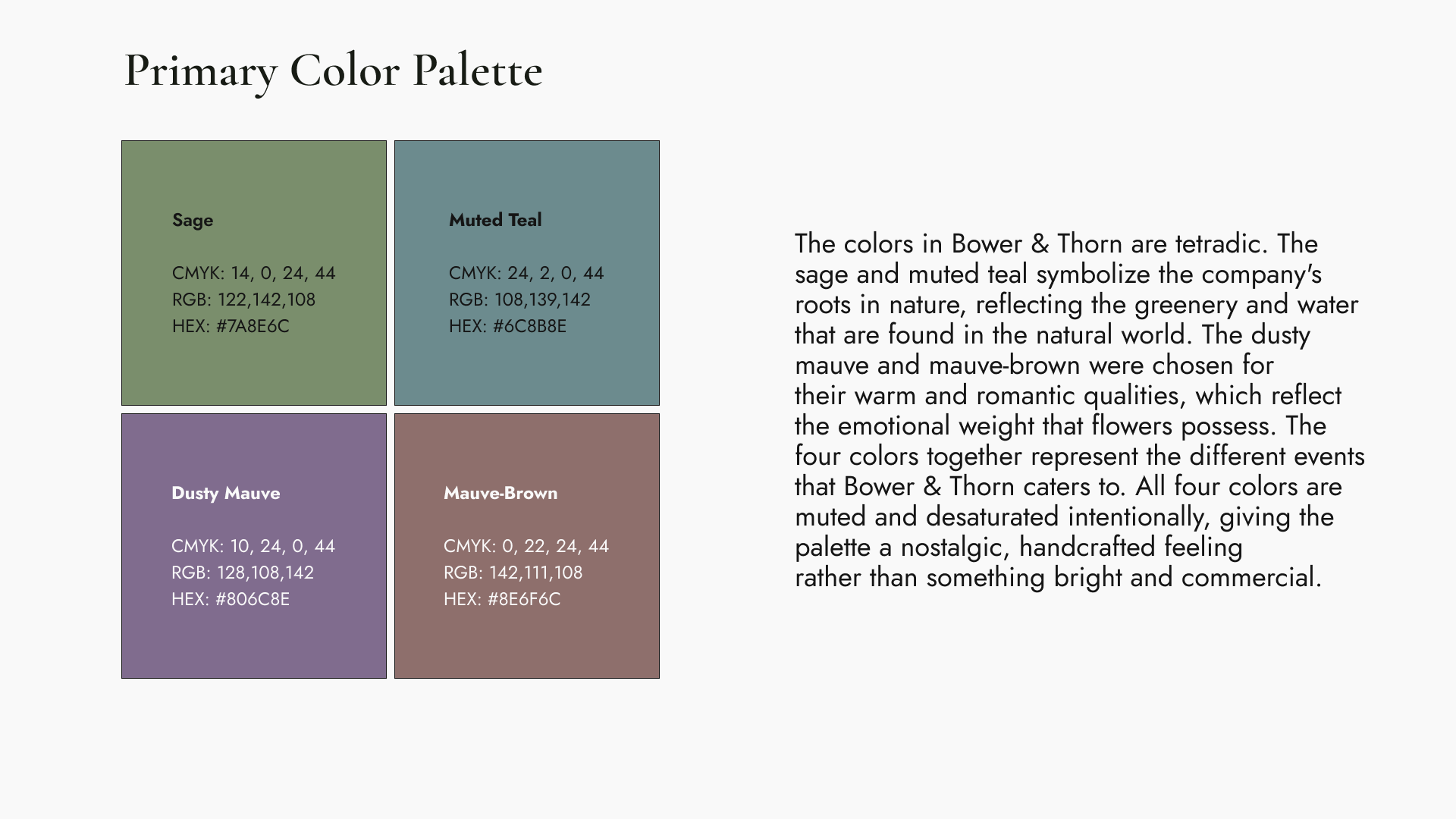
Primary Color Palette
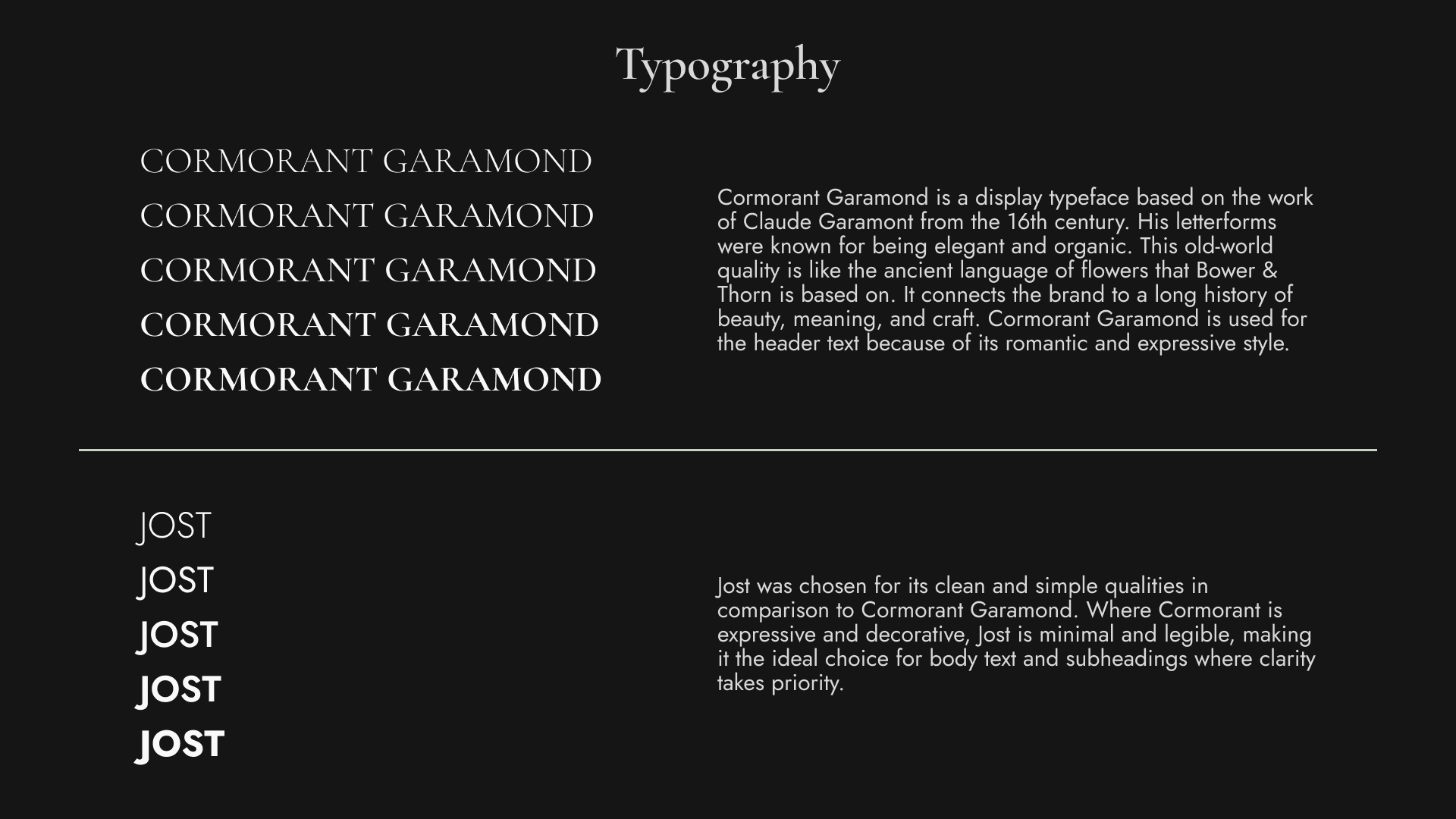
Typography
Full Style Guide
View the complete Bower & Thorn brand style guide in Figma.